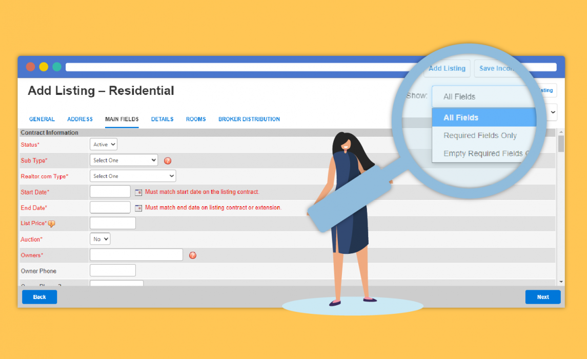
FlexMLS is refreshing the look of the Add/Change Listing pages to bring you a better user experience! The function of the pages will remain unchanged, and you’ll see familiar tabs and fields in the same locations. This change gives the Add Listing and Change Listing pages a modern look that more closely matches the experience on other Flexmls pages and on mobile devices.
What Changed?
Tabs, buttons, and colors have been updated to match the more modern UI of newer Flexmls pages. Most noticeably, the display of required fields is streamlined. Previously, the entire row was highlighted when a field was required. Field names were displayed in red and inside brackets. With this change, names of required fields are now displayed in red text with an asterisk, and rows are not be highlighted.

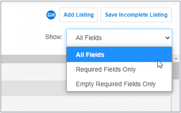
Note: Use the Show menu in the upper right corner to more easily identify required fields. You can choose to show all fields, required fields only, or empty required fields only.

This update is just the first step in the process of modernizing these pages. FlexMLS knows that more updates are needed, and they will continue to improve this critical function while minimizing the impact to you.


Comments