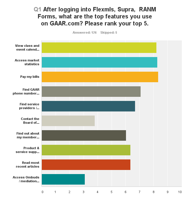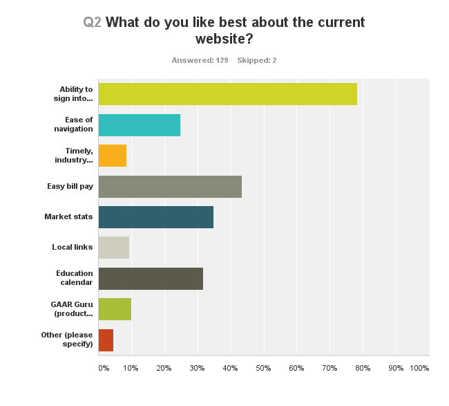
Thank you to our members who took the time to take our brief survey on the upcoming gaar.com redesign.
We had over 100 respondents and your voices have been heard loud and clear! Overall, the primary feedback was to improve navigation, which is our #1 priority on this redesign as well. Our plan is to restructure the navigation to make it easier and more intuitive to find the information you need as a member of GAAR.
In addition, many of you expressed an interest in improvements to loading times and mobile access, both of which are high priority in the redesign.
At the same time as the new gaar.com launches, we will also be switching our backend membership, education and billing functions to a new system that will allow for easier integration with our website and allow users access via Single Sign-On (SSO) to things like bill pay and education registration.
Here is a list of just some of the things you can look forward to in the redesign:
- Easier access to latest news and blog posts
- Permanent pages for our major events (Golf Tournament, Awards Gala, etc.)
- Improved Affiliate section
- Easier access to member benefits information
- More information on our advocacy efforts
- Improved responsive design
- Improved market statistics, powered by 10K
- Easy-to-use navigation
- SSO access to class registration and bill pay
- and MORE!
Check below for full survey results. The new version of GAAR.com will launch late September of this year.


Comments